

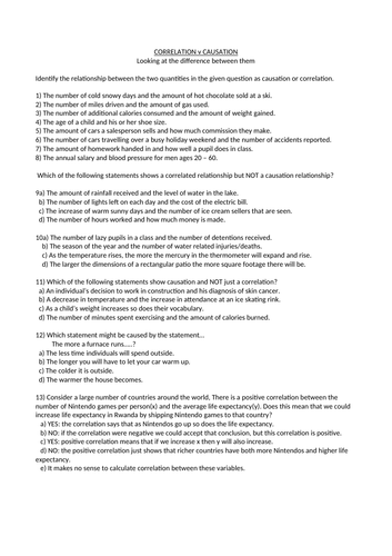
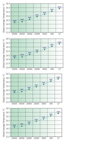
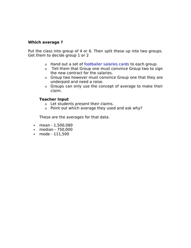
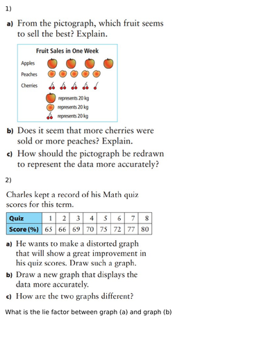

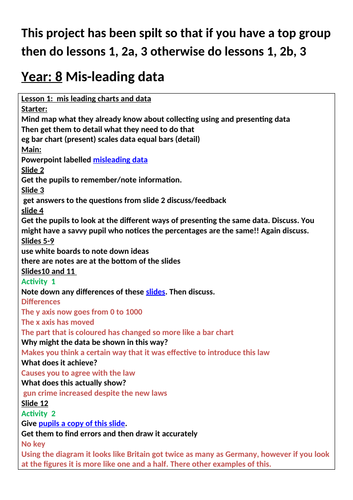

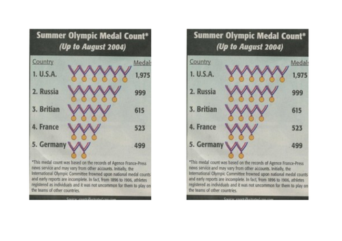
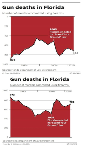
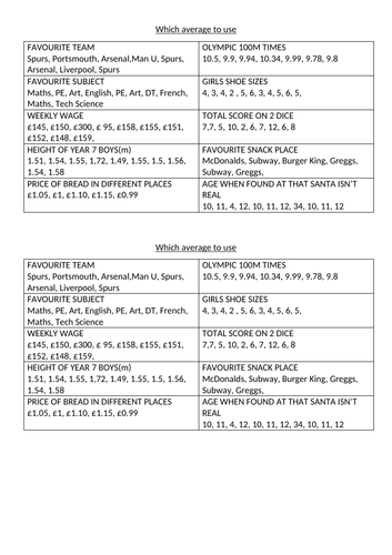
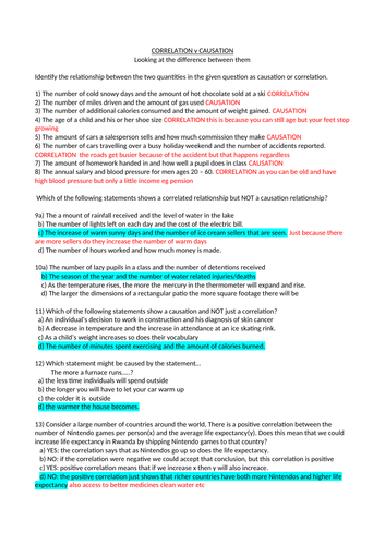
This is a series of three lessons I put together for an end of term project for year 8 (but is accessible for all) about how data can be skewed to meet the needs of its owner, and how to question images that are being presented. It also includes a lesson on how big the ‘lie’ can be, as well as looking at the difference between correlation and causation. The is also work on why we have three averages and when we use which one. It finishes with a link to a site about spurious data.
Something went wrong, please try again later.
This resource hasn't been reviewed yet
To ensure quality for our reviews, only customers who have purchased this resource can review it
Report this resourceto let us know if it violates our terms and conditions.
Our customer service team will review your report and will be in touch.
£12.00