


Recent
Most read
Most shared

In Arthur Conan Doyle’s A Scandal in Bohemia, his protagonist Sherlock Holmes reminds us that “it is a capital mistake to theorize before one has data. Insensibly one begins to twist facts to suit theories, instead of theories to suit facts.”
But many teachers will tell you that this is missing a step. It isn’t just about having the data, but about having it in a format that is coherent, simple and malleable.
It has become something of a cliché to say that having one person who “crunches the data” is as sensible as a hospital registrar hoarding all the X-rays, but the principle remains true.
It is now broadly accepted that all teachers should be using data analysis to evaluate the impact of their teaching. However, there is often little advice on how to present abstract, complex data sets in a way that the classroom practitioner can use and understand. Sharing the data in its raw form can just make it seem like a list of numbers, its significance lost.
But it does not have to be this way. In my school we use a combination of custom-built tools and commercial software packages to capture and interrogate data. And, although a number of amazing bespoke software packages are available, these are not necessarily required: the basic Microsoft Office applications provide a range of methods for presenting complex data in a coherent, user-friendly fashion.
Of course, the setting of a target or the creation of a fancy graph will never, in isolation, raise standards; it is our teaching and work with individual pupils which achieves that. However, the data can help us to know where to praise and cajole where necessary, and when to create (and where to target) interventions.
The irony is that - when used correctly - the Excel spreadsheet can help us to treat pupils as individuals rather than a list of numbers. A focused tracking system of frequent, low-stakes, informative and supportive assessments can help to remind students what it is they need to know and what they need to do to improve.
Many of us will have heard busy teachers complain that it is hard to make sense of a complex spreadsheet. One way of overcoming this problem and presenting data for action is through the use of heat maps.
Put simply, a heat map is a two-dimensional representation of data in which values are depicted by colours. A simple heat map can provide an immediate visual summary of how pupils are making progress against a series of qualitative metrics. More elaborate heat maps can allow teachers, as well as middle and senior leaders, to understand more complex data sets.
Heat maps can be displayed in many ways, but they all have one thing in common - they use colour to communicate relationships between data values which would be would be much harder to understand if presented numerically in a spreadsheet.
In our school, for example, using data for a whole year group has become a method of “stress testing” the quality of our curriculum provision.
In every year group, staff have designed a series of “mastery statements” based on the knowledge and skills someone achieving success at GCSE and beyond would need to possess. Working backwards, we have identified a series of 90 “mastery points” in each subject, which are anchored to the national curriculum and the 9-1 grading system for the new GCSEs, which will be taught from September. This information is collated and presented to leaders and subject teachers as a heat map (see figure 1).
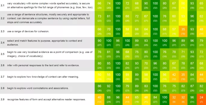
Figure 1 Heat Map of Year 7 English
Although our system uses bespoke software, similar results can be achieved with standard office packages. You can generate heat maps using the surface chart option in Microsoft Excel, for example. Although Excel’s default colour range is not necessarily conducive to heat maps, the colours can be edited.
The demise of national curriculum levels presents an opportunity to do far more useful and exciting things with data and we should be more enthusiastic than daunted at the prospect. Using no more than a simple set of Office tools we can implement systems that are precise, reliable and easily understood by a wide audience.
Whatever day-to-day data we collect, our pupils need to be assessed against some form of benchmark over the course of each year. Simple ICT tools can help us to capture what our pupils have learned and what progress they have made. With this information we can ensure that they are on track to meet expectations and take action if individual students are falling behind.
A well-constructed system can ensure that data is the servant, not the master, of a principled curriculum. In other words, the presentation of data can work with and not against our main objective - to help our pupils gain the skills and qualifications they need to succeed in future.
Dr Nigel Matthias is deputy headteacher of Bay House School and Sixth Form in Gosport, Hampshire