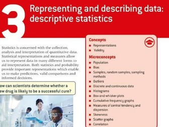
I have gone over all the criteria for theBTEC TECH AWARD LEVEL 1/2 January 2024 - Component 2: Collecting, Presenting and Interpreting Data Pearson Set Assignment.
I have covered how to complete EVERY task 1-3 BUT I have used a completely different data set as to not break the rules of the exam board.
You can use these resources to PRACTICE the controlled assessment.
I also have a cheaper bundle of resources for Comp1, Comp2 & Comp3.
https://www.tes.com/teaching-resource/btec-tech-award-l1-2-component-1-2-and-3-12943995
This includes all the resources I have created for the Pearson BTEC Level1/Level 2 course.
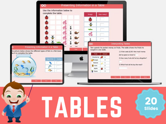
Tables: Interpret and Represent Data Interactive Digital Maths Activities
Introducing this comprehensive digital maths resource designed specifically for Year 2 students to master the art of presenting and reading information from tables in statistics! With this interactive learning tool, students will develop a solid foundation in data representation and analysis while having fun along the way.
Save over 20% when you buy it as part of the Tables and Tally charts Bundle
Our Year 2 Statistics Digital Resource provides a dynamic and engaging learning experience that captures students’ attention from start to finish. The carefully crafted content is aligned with the curriculum standards, ensuring that students are equipped with the necessary skills and knowledge needed in interpreting and representing data using tables.
Through a series of interactive lessons and activities, your year 2 students will learn how to create, interpret, and use tables effectively. They will discover the significance of tables as a quick and efficient way to record and count data. With the guidance of our intuitive interface, students can practice creating tables in a virtual environment, enabling them to sharpen their skills at their own pace.
To enhance the learning experience, our Year 2 Statistics Digital Resource incorporates interactive self-marking activities using vibrant graphics. Students can put their knowledge to the test with interactive challenges that reinforce their understanding of tables. Additionally, our resource offers progress tracking features, allowing students and educators to monitor performance and identify areas for improvement.
Whether used in the classroom or at home, our Year 2 Statistics Digital Resource provides an immersive learning environment that supports students’ growth in statistics.
Other related resources in this category include:
Carroll and Venn diagrams
Block Diagrams
3.Tally Charts
A set of questions on interpretation and presentation of data, observation, fair testing, use of different keys. Some questions can give you ideas for lab activities.
Please find within this download:
A detailed and engaging PowerPoint, Differentiated (SEN, LA, MA, HA & Mastery) Worksheet with Answer Sheet for a complete lesson on this National Curriculum Statement: Interpret and present data using bar charts, pictograms and tables.
The PowerPoint has the following features:
→ Differentiated starter activity (plus extension)
→ Extremely logical and simplistic explanations with animated examples and pictures to aid learning
→ Clear, detailed and engaging activities built into the PowerPoint to aid your AfL as you teach
→ Tasks linked to and based around identifying information from bar charts, pictograms and tables
→ Beautiful animations, images and graphs used to draw children’s attention to the key messages of the PowerPoint
→ Learning Objective and differentiated success criteria which is clearly visible for all children
→ Animated count-down timer so children know how long they have left of the lesson (this is also good for teachers as it reminds you when to do mini-plenaries/feedback/etc).
The Word Document has the following features:
→ Differentiated activities on one sheet from SEN, LA, MA, HA and Mastery Challenge
→ Coloured activity boxes to help you quickly assign tasks to children
→ Learning objective and short date (which automatically updates to the day you open the document)
→ Differentiated success criteria that link with the PowerPoint
→ Answer sheet included for all questions
Explore our other Year 3 Statistics Lessons:
Interpret and present data using bar charts, pictograms and tables
Solve one-step and two-step questions (for example ‘How many more’ and ‘How many fewer?’) using information presented in scaled bar charts and pictograms and tables
I made this up after working on similar resources to find information from data. There is a much simpler version at the bottom for children with AEN. Most children were able to work on one step problems when interpreting data. Once this is completed I will give them one and two step problems. More able will be able to write their own.
A really fun and unusual lesson using a piece of sheet music to collect data using a tally chart, interpret from a tally chart, present the data in a bar chart and pie chart and further interpret the data using a real-life question. Very enjoyable and no knowledge or prior understanding of sheet music needed. Also Christmas themed (the song used is Jingle Bells) so great for engaging students at that time of year.
Looking for an in-tray task to support the recruitment process for an assistant or deputy headteacher? This data analysis task requires the candidate to analyse and interpret the data to identify trends, patterns and areas for improvement. They would need to demonstrate their ability to extract meaningful insights from the data, make evidence-based recommendations and propose strategies for enhancing pupil achievement and wellbeing. Additionally, the candidate would be expected to showcase their proficiency in using data analysis tools and present their findings in a clear and concise manner, highlighting their strong analytical skills and their capacity to inform decision-making in an educational setting.
This resource is useful for those recruiting for an assistant headteacher or deputy headteacher position, as well as those applying as a candidate for the role to help prepare for the interview. We’ve also included a worked example of some survey data that could be used as part of the process.
Looking for more interview tasks, take a look at our other options or interview task bundle.
Visit our website to find more - Honeyguide SLS
Disclaimer: This resource is intended solely for informational purposes and should not be interpreted as professional advice. The information provided herein is not tailored to your specific circumstances therefore we can not guarantee the completeness, accuracy or appropriateness of the information presented. Any reliance you place on the information provided is strictly at your own risk.
Includes:
- Finding and sorting Information
- Displaying Information (line graphs, tally charts, bar charts/graphs, Carroll diagrams and Venn diagrams)
- Code breakers
- Interpreting data
Can be adapted for upper KS1 and lower KS2
In depth PowerPoint with Google Slides (for pupil activity )accompanied with a Loom video with all the answers.
Also included is Smart board (flipchart) presentation of the entire lesson.
This presentation has several examples of two-way charts, focusing on reading and interpreting.
The teacher demonstrates as pupils find two-way tables tricky at times.
Answers are provided.
The answers are provided in the Loom presentation which allows the pupils to self-assess.
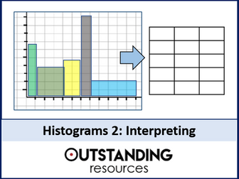
This is a whole lesson on Histograms that builds on lesson one by calculating backwards to find the frequency, total sample size and problems involving the use of a key. This lesson is ready to go, with no prep required. It is also great for home learning. 12-slide presentation + extra resources.
It lesson comes with:
Starter (linked to the previous lesson - histograms 1)
Learning Objectives (differentiated)
keywords
superb teaching slides
excellent examples
key questions
2 Worksheets (with answers)
Plenary
ALL LESSONS on Statistics in one BIG Bundle:
Statistics: All Lessons
Please NOTE:
This lesson is flat-packed for copyright purposes, which means limited editing in places, but slides can be deleted, rearranged and slides can obviously be added.
Please provide a RATING with written feedback
Email outstandingresourceshelp@gmail.com if there are any issues and we will respond within 48 hours.
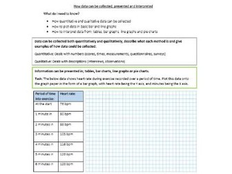
Student worksheets for ‘How data can be collected, presented and interpreted’. Pack includes; a lower ability worksheet, a higher ability worksheet and a teacher answer sheet.
This resource is an introduction to statistics.
It contains nine subjective questions on presentation of data in a frequency table, it essentially deals with interpretation of data presented in a frequency table.
It is a good resource to use as an exit card or even as an review of previous knowledge.
I hope you find it useful.
THANK YOU
Year 3 Statistics Interpret & Present Bar Chart Data
This Year 3 Maths Statistics Read and Interpret Data Using Bar Charts Question Set covers the national curriculum objective to read and interpret data using bar charts.
Registering for an LbQ account will give you access to the questions included in this resource and many 1,000s more. These 5 questions are a small selection from a much bigger Question Set of the same topic; they can be used as a teaching starter, plenary or activity for pupils. It is designed to provide teachers a taste of what our content is all about.
LbQ Maths Question Sets are based around the principles of mastery and have been developed by teachers and subject matter experts. Each Question Set targets a curriculum objective, though some objectives need more than one set, and has been guided by the White Rose Maths curriculum breakdown.
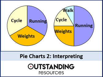
This is the 2nd lesson fantastic lesson on Pie Charts. This builds on the first lesson on drawing pie charts by looking at how to interpret (calculate frequencies) from a pie chart. This tends to be a popular exam question. This lesson is ready to go, with no prep required. It is also a great lesson for home or distance learning. Great as well for flip learning. 16-slide presentation + ORIGINAL VIDEO CONTENT + supplementary resources.
The lesson includes:
+ Starter – Matching activity (linking to why we draw pie charts)
+ Learning Objectives (differentiated)
+ Activity recapping drawing pie charts
+ Key Calculation
+ superb teaching slides
+ Lots of examples
+ FULL ORIGINAL VIDEO CONTENT (14 MINS)
+ Worksheet (with answer key)
+ Matching Activities (+ answer key)
+ Helpsheet (great for student notes)
+ Plenary
ALL LESSONS on Statistics in one MEGA BIG Bundle:
Statistics: All Lessons + All Resources
LASTLY:
This lesson is flat-packed (limited editing) for copyright purposes
Please provide a RATING with written feedback
Please email outstandingresourceshelp@gmail.com if there are any issues.
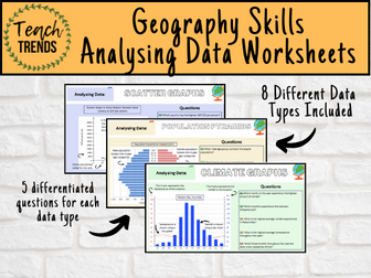
Enhance your pupils’ geographical skills with a series of interpretation and analysis sheets and questions. This resource includes 8 PowerPoint slides with corresponding questions all focused on a different data presentation method. Ideal for preparing your pupils for exams and revising analysis skills. The high quality slides include annotation, examples and five scaled-ability questions.
The data presentation skills included in this resource are:
Climate Graphs
Population Pyramids
Choropleth Maps
Scatter Graphs
Pie Charts
Demographic Transition Model
Proportional Symbols Map
Divided / Stacked Bar Charts
Resource downloaded in PDF and PowerPoint Format.
A collection of PowerPoint presentations for teachers to teach a range of topics related to data representation.
This includes binary, hexadecimal, units of storage, representing sound, and character sets.
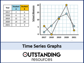
This is a whole lesson on Time Series Graphs and Interpreting Charts. The lesson looks at how to draw time series graphs as well as interpreting from a host of different graphs. This lesson links well to cross curricular links. This lesson is ready to go, with no prep required. It is also great for home learning. 19-slide presentation + worksheet.
The lesson includes:
Starter
Learning objectives (differentiated)
Keywords
MWB activity to assess understanding (AFL)
very clear teaching slides (lots of custom animation)
lots of examples
Differentiated worksheet (with answers)
Plenary
ALL LESSONS on Statistics in one BIG Bundle:
Statistics: ALL Lessons
LASTLY:
This lesson is flat packed for copyright purposes.
Please provide a RATING with written feedback.
Please email outstandingresourceshelp@gmail.com if there are any issues and we will respond within 48 hours.
This PowerPoint follows the Oxford textbook.
The following content is covered throughout the PowerPoint. I have also added a few extra concepts which can be used in students Internal Assessments (IA). For example, I spend a little time looking at the skewness formula, different ways of calculating outliers, 1.5 x IQR or 2 X SD, skewness in box plots, etc.
Univariate data
* qualitative vs quantitative
* continuous vs discrete
* which representations are used for specific types of data
* primary and secondary data
* choosing a good sample
* sampling bias
* reliability vs validity
* skewness
Questionnaires
* biased questions
Measures of central tendency
* mean, meadian, mode
* outliers
* un-grouped and grouped
* how to use the GDC
* combined mean
Measures of dispersion
* range, quartiles, IQR, standard deviation
* normal distribution curve
* skewness
* different formulas for sample and population for SD
* how to use the GDC
* effects on mean and SD
Sampling techniques
Presentation of data
Bivariate data
* scatter graphs
* correlation
* introduction into the line of best fit (leading into chapter 6)
Throughout the PowerPoint there are worked examples and student exercises. There are also multiple links to various classroom and interactive activities using GeoGebra and Desmos Classrooms. As well, I have included links to certain Youtube videos to help with using the GDC.
A Comprehensive Presentation that includes assistance:
1. To recognize how data can be used to identify and characterize the classroom.
2. To interpret a class set of data using MIDYIS graphs.
3. To distinguish between effective and ineffective teaching methods for the individual.
This is a PowerPoint presentation which focuses on reading and interpreting line graphs. Several examples of questions are given. Pupils are shown through animations how to read information from a line graph. They are also shown how to interpret reading on a scale and to work out the range between two values. This presentation has been designed in particular for Year 6 pupils and would be ideal for SATs revision. However, it would be appropriate for pupils in upper KS2 or lower KS3.
I made this worksheet for Year three children. They have to label the horizontal bar chart, complete the tally chart and then answer some True or False questions and explain how they know, to prove it. The questions are differentiated. LO and SC on the worksheet to help with marking.
Will save lots of time.