
Population and the Environment
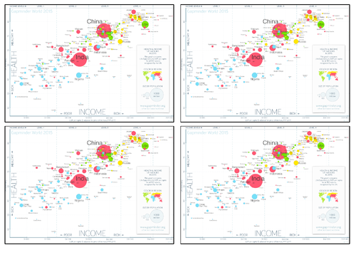
What is the graph showing you?
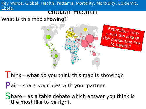
Think – what do you think this map is showing?
Pair – share your idea with your partner.
Share – as a table debate which answer you think is the most like to be right.
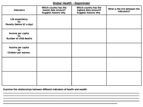
What is global health? Students make notes on global health. Students look at the gapminder worksheet and answer the following questions;
- Comment on relationships shown on the scatter graph.
- Suggest reasons for the correlations.
Students watch the video from; https://www.youtube.com/watch?v=jbkSRLYSojo
Gap minder website; students create their own scatter graph by using the data (click on data and visualise). Examine the relationships between different indicators of health and wealth and complete their worksheet.
Is there a strong correlation between the indicators of health and wealth? Students debate over this question.
Something went wrong, please try again later.
This lesson could do with an instruction sheet/lesson plan with it
Report this resourceto let us know if it violates our terms and conditions.
Our customer service team will review your report and will be in touch.
£2.50