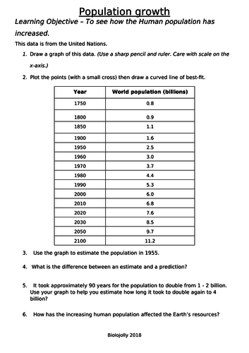

This is a graph drawing task with irregular time intervals. I find it best to do this at the start of a lesson on Human population growth. This leads on to discussions about waste management and pollution. If you ‘google’ world population you get a counter showing changing population in ‘real’ time. I have this running on my screen throughout the lesson. Note down number at the start and end of lesson to get a feel for the scale of this.
Something went wrong, please try again later.
This resource hasn't been reviewed yet
To ensure quality for our reviews, only customers who have purchased this resource can review it
Report this resourceto let us know if it violates our terms and conditions.
Our customer service team will review your report and will be in touch.
£3.00