
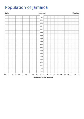
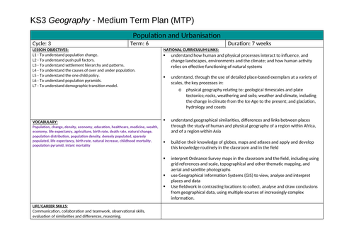
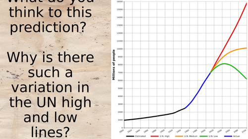
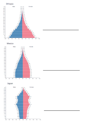
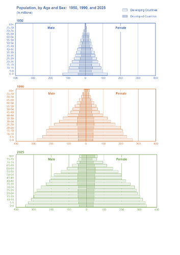
A fully resourced lesson comparing a variety of population pyramids from developing to developed countries ( LIC, MIC and HIC ). It also covers a variety of graphs to present data such as a compound bar chart, compound line graph, proportional symbols, choropleth map and a scatter graph. Activities include making comparisons and judgements between population pyramids from different countries with opportunities for discussion around the factors that create these population distributions. This is lesson 6/7 in a sequence on populations and urbanisation
Something went wrong, please try again later.
This resource hasn't been reviewed yet
To ensure quality for our reviews, only customers who have downloaded this resource can review it
Report this resourceto let us know if it violates our terms and conditions.
Our customer service team will review your report and will be in touch.
£0.00