
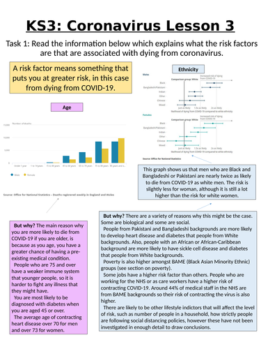
This is the third lesson in the coronavirus series. This lesson looks at 4 risk factors for the disease and explores the reasons behind these risk factors (Ethnicity, Poverty, Health and Age). Students will then look at maps to show the distribution of these risk factors across the country and make predictions as to where they think the death toll will be highest. They will then compare their predictions to a death map created by the ONS and comment on which of the risk factors provided the most/least accurate prediction.
There is a key stage 4 version of this lesson which uses slightly more tricky terminology, but there isn’t a large difference in these lessons.
Something went wrong, please try again later.
This resource hasn't been reviewed yet
To ensure quality for our reviews, only customers who have downloaded this resource can review it
Report this resourceto let us know if it violates our terms and conditions.
Our customer service team will review your report and will be in touch.
£0.00