

I have found that my IB physics students do not know how to use Microsoft Excel well in order to plot graphs of their data in their internal assessment.
I created this tutorial for my students to walk them through plotting graphs.
This includes:
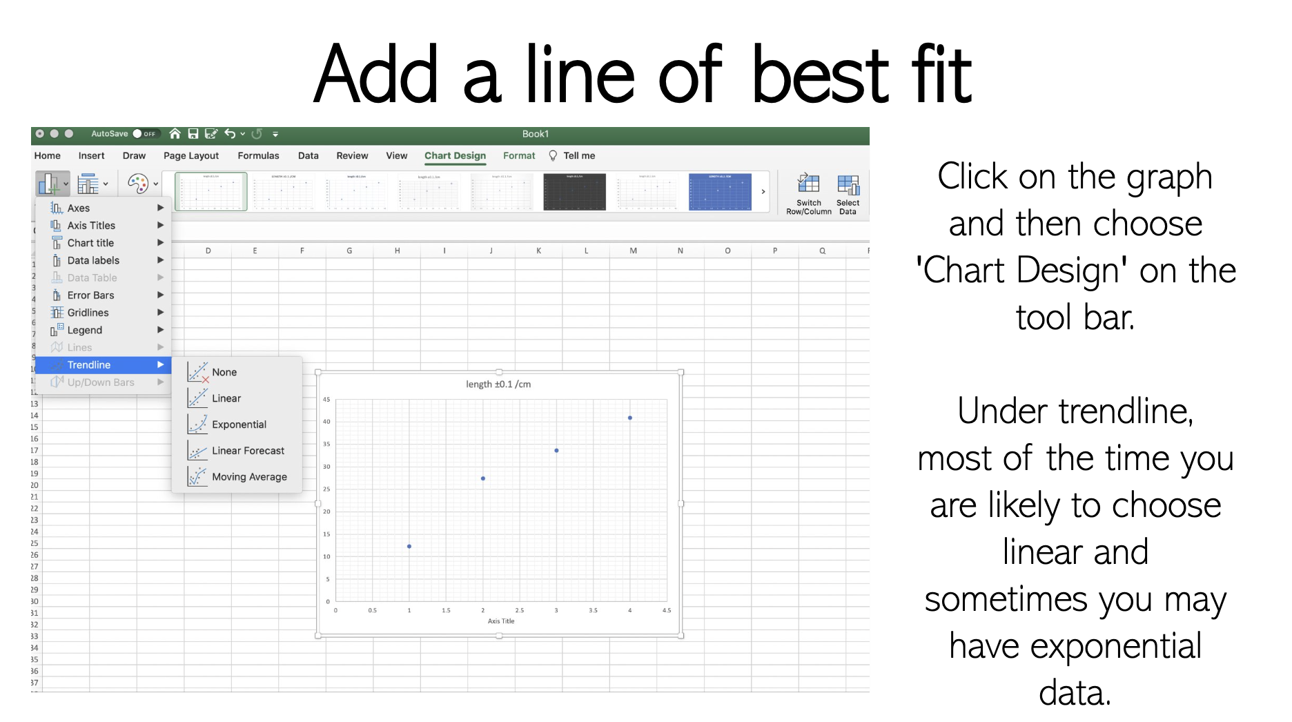
- basics: how to add a title / how to add minor gridlines / how to add a line of best fit
- how to format your trend line to ensure students extrapolate their trend line through the y axis & show the equation of the line
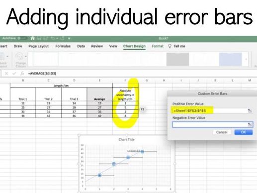
- how to add custom individual error bars on each data point
- how to add worst fit lines that pass through the error bars
Something went wrong, please try again later.
This resource hasn't been reviewed yet
To ensure quality for our reviews, only customers who have purchased this resource can review it
Report this resourceto let us know if it violates our terms and conditions.
Our customer service team will review your report and will be in touch.
£1.00