

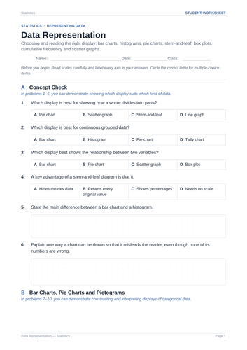

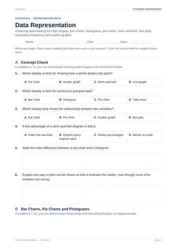
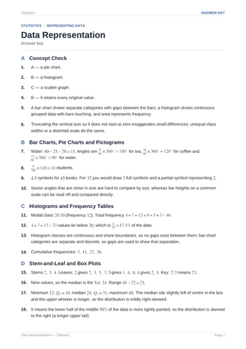
Master graphical data representation with this Data Analysis worksheet! Covers choosing appropriate charts, constructing and reading pie charts, histograms, stem-and-leaf diagrams, box plots, cumulative frequency curves, scatter graphs, evaluating misleading displays, and answer key.
This comprehensive 6-page student worksheet is designed to help students master data representation and visualization techniques. It guides learners step-by-step from choosing appropriate visual displays and calculating pie chart sector angles to interpreting grouped histograms, constructing stem-and-leaf diagrams, analyzing correlation on scatter plots, and critically evaluating misleading graphical representations.
What is Included:
Section A: Concept Check: Evaluates foundational understanding of matching data types to optimal displays (such as pie charts, histograms, scatter graphs, and stem-and-leaf diagrams), identifying key differences between bar charts and histograms, and recognizing misleading chart features.
Section B: Bar Charts, Pie Charts and Pictograms: Focuses on calculating sector angles for categorical pie charts, finding raw frequencies from sector measurements, interpreting pictogram symbols, and evaluating when pie charts are ineffective.
Section C: Histograms and Frequency Tables: Guides students through reading grouped continuous data histograms, determining modal classes and total frequencies, estimating dataset proportions, understanding why histogram bars touch, and filling out cumulative frequency columns.
Section D: Stem-and-Leaf and Box Plots: Covers constructing ordered stem-and-leaf diagrams with keys, finding medians and ranges from raw displays, extracting 5-number summaries from box plots, and interpreting distribution skewness based on median positioning.
Section E: Cumulative Frequency and Scatter Graphs: Focuses on estimating medians and interquartile ranges from cumulative frequency curves, analyzing positive and negative correlation in scatter plots, and calculating gradients for lines of best fit to make predictions.
Section F: Choosing and Criticising Displays: Features critical thinking challenges in selecting optimal displays for categorical, continuous, and bivariate data, analyzing the impact of truncated vertical axes, and comparing distributions with identical means and ranges.
Teacher Benefits:
Ready to Print & Go: Zero prep required. Excellent for structured classroom lessons, targeted homework assignments, independent practice, sub plans, or unit assessment preparation.
Complete Solutions Included: Comes with a fully worked answer key detailing conceptual checks, exact sector angle calculations, graph interpretations, and step-by-step statistical reasoning.
Scaffolded & Comprehensive: Progresses logically from basic chart recognition to multi-step graph construction, trend analysis, and critical data evaluation.
Something went wrong, please try again later.
This resource hasn't been reviewed yet
To ensure quality for our reviews, only customers who have purchased this resource can review it
Report this resourceto let us know if it violates our terms and conditions.
Our customer service team will review your report and will be in touch.
£4.00