

Teach your students how to record data accurately and present results clearly with this complete lesson pack.
Designed for the WJEC/KS3 “I’m a Scientist” unit, this lesson builds on students’ understanding of fair testing and scientific enquiry by focusing on how to structure tables, draw graphs, and interpret data effectively.
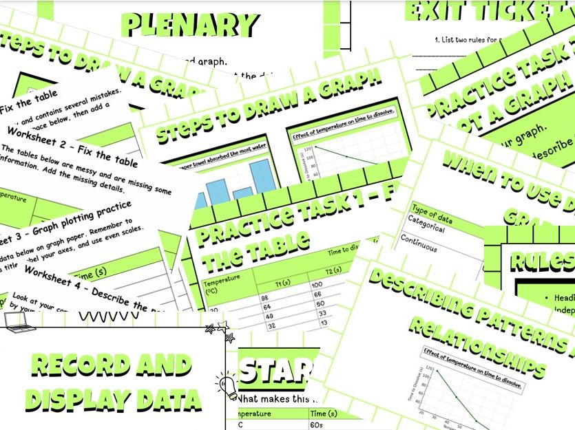
Lesson content includes:
Recognising and correcting poor data presentation
Rules for clear, accurate results tables
When to use bar charts (vs line graphs)
Step-by-step graph-drawing guidance
Identifying and describing simple patterns or correlations
What’s included:
PowerPoint (.pptx) – 11 slides with examples, step-by-step guidance, and teacher notes
Worksheets 1 & 2 – Fix the Table – rewrite messy tables correctly
Worksheet 3 – Graph Plotting Practice – Temperature vs Time dataset with graph prompts
Worksheet 4 – Describe the Pattern – sentence frames for interpreting results
Exit Ticket – short plenary/reflection task
Teacher Answer Key (.pdf) – model tables.
How it can be used:
Complete 60-minute lesson for Year 7 or KS3 science skills review
Perfect for cover lessons, revision, or assessment practice
Supports WJEC and KS3 Working Scientifically outcomes
Keywords: Year 7 Science, KS3 Science, data presentation, tables and graphs, bar chart, line graph, scientific method, recording results, correlation, worksheet, WJEC, PowerPoint, PDF, zip.
File Types: .pptx (PowerPoint), .pdf (worksheets + answers), .zip (complete pack)
Something went wrong, please try again later.
This resource hasn't been reviewed yet
To ensure quality for our reviews, only customers who have purchased this resource can review it
Report this resourceto let us know if it violates our terms and conditions.
Our customer service team will review your report and will be in touch.
£3.00