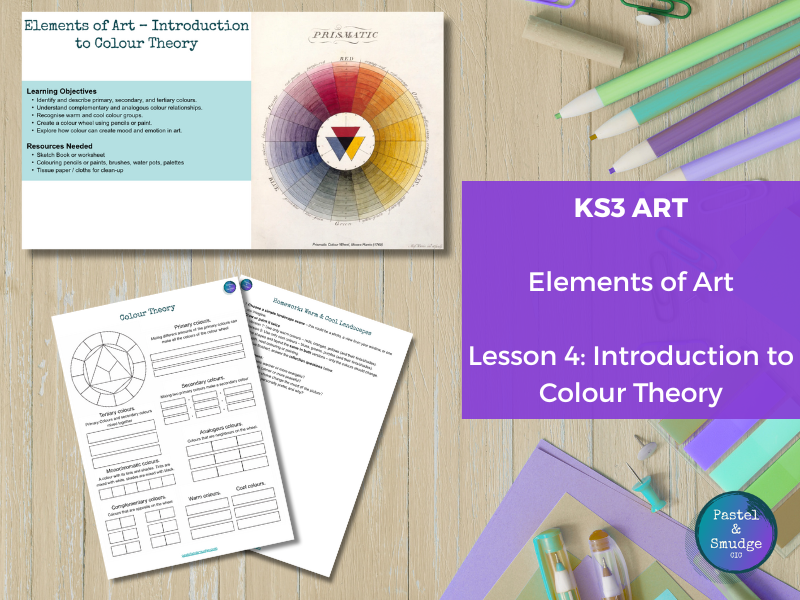


A complete KS3 Art lesson introducing Colour Theory and how artists use colour to create mood, harmony, and contrast. Students explore the relationships between primary, secondary, and tertiary colours, as well as complementary, analogous, warm, and cool colour schemes.
Through examples from Vincent van Gogh, Mark Rothko, Andy Warhol, and Claude Monet, learners discover how colour choices communicate emotion and depth in artwork.
Students will:
- Understand the basics of colour theory and the colour wheel.
- Identify and describe colour relationships and harmonies.
- Experiment with warm and cool colour palettes to show mood.
- Create two contrasting landscape artworks to compare emotional impact.
What’s included:
- Editable PowerPoint presentation with artist examples and clear explanations.
- Printable colour wheel reference and worksheet activities.
- Homework task: Warm vs. Cool Landscape Challenge.
Perfect for KS3 (and adaptable for upper KS2), this lesson builds both knowledge and practical skill in colour mixing and emotional expression through art. Differentiated for SEN learners, with guided examples and step-by-step visuals.
A vibrant and inspiring session that helps students see how colour transforms art and emotion.
Something went wrong, please try again later.
This resource hasn't been reviewed yet
To ensure quality for our reviews, only customers who have purchased this resource can review it
Report this resourceto let us know if it violates our terms and conditions.
Our customer service team will review your report and will be in touch.
£5.00