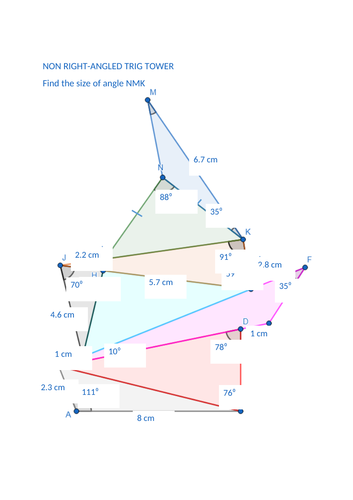
Hero image

53Uploads

27k+Views

20k+Downloads

Dienes Blocks and Percentages
MrGrayMathsMrGrayMaths

Dienes Blocks and Percentages

(0)
A set of tasks using Dienes blocks to make connections with percentages. I used it as a handout for the pupils. On reflection it might work better with the “information” bits being used as teacher notes then pupils trying the tasks in their jotters. The “information” could be used as teacher led examples on the whiteboard using the mathbot website while the pupils working through the tasks with the manipulatives and whiteboards to get the answers. I worried too much about pupils recording their answers and methods which got in the way of them actually using the manipulatives. I’d recommend just leaving the pupils to use the blocks to get their answers and build an understanding first and then firm up the formal layout in later lessons. I’ve included the resource as a PDF and a Word doc which you can edit as you see fit.
Pythagoas and Cuisenaire rods
MrGrayMathsMrGrayMaths

Pythagoas and Cuisenaire rods

(0)
A powerpoint to lead discussion introducing Pythagoras with Cuisenaire rods. A bit rough and ready / stream of consciousness in places but hopefully may be useful giving others some ideas / inspiration.
Correlation and causation: Higher Applications of Maths
MrGrayMathsMrGrayMaths

Correlation and causation: Higher Applications of Maths

(0)
A task which involves generating scatterplots and correlation coefficients using nutritional information from a McDonalds menu. Worksheet and csv dataset. Points of interest: Menu is from America leading to a discussion about how useful is it for use in UK High number of breakfast items and low number of burgers doesn’t reflect common perception of McD’s menu Sodium (ie salt) and calories have a strong correlation but this is a spurious relationship (salt has no calories) with portion size being a possible confounding variable
Pearson correlation coefficient tasks: Higher Applications of Maths
MrGrayMathsMrGrayMaths

Pearson correlation coefficient tasks: Higher Applications of Maths

(0)
Two tasks: One calculating the Pearson correlation coefficient by hand. A right pain in the backside and shows why we use computers to do such a thing (worth noting doing this by hand is something that could be assessed if doing Level 6 Numeracy). One getting pupils used to coding the correlation coefficient using statistical software (using the attached csv dataset) and seeing what it means in terms of the regression line without context getting in the way.
Solving Trigonometric Equations With Graphs
MrGrayMathsMrGrayMaths

Solving Trigonometric Equations With Graphs

(1)
First handful of questions have pupils solving trigonometric equations by sketching graphs to identify which quadrants solutions lie in and using the symmetry of said graphs to find the value of these solutions. The second half of the task changes the problems to have pupils working back from a graph or solution to create the equations for themselves. EDIT: There are a couple of errors on the last page of the answer file.
Thinking about averages and spread using towers
MrGrayMathsMrGrayMaths

Thinking about averages and spread using towers

(0)
This task focuses on what the averages look like rather than how to calculate them. This could be done with piles of blocks/cubes if you wish (though some of the means work out with decimal values). Inspired by the “mean average equal sharing” activity by Don Steward: Resources uploaded: PDF of resource Editable Excel spreadsheet of resource Don Sterward slides from above link
The Discriminant - Increasingly Difficult Exercise
MrGrayMathsMrGrayMaths

The Discriminant - Increasingly Difficult Exercise

(0)
An increasingly difficult exercise on the nature of the roots of quadratics which can be solved with the skills taught at National 5 (though moves beyond the style of question the SQA would ask). Inspired by Dave Taylor’s Increasingly Difficult Questions website. Also included are a set of “basic” essential skills questions too (taken from the Free National 5 Maths website).
Graphing continuous data (Spotify playlist data): Higher Applications of Maths
MrGrayMathsMrGrayMaths

Graphing continuous data (Spotify playlist data): Higher Applications of Maths

(0)
Pupils use histograms and boxplots to illustrate various continuous numerical variables in RStudio using a csv dataset. Variables are values Spotify uses to categorise songs. Songs in the dataset and taken from a playlist. A bit of fun included asking pupils to pick some songs that would suit the tastes of the person who created the playlist (me!). If you use this and pupils make suggestions let me know on Twitter at @bucksburnmaths. To give pupils an idea of what tempo feels like I play them Juice by Lizzo which is 120 bpm. Also played them You Suffer by Napalm Death (1.3 seconds long) and Mogwai Fear Satan by Mogwai (16 minutes long) as a way of talking about outliers. Plus, any excuse to talk about the 1980s grindcore scene!