

What size font should you use for visually impaired students?
And does the choice of font itself matter?
Even more importantly, how far back in the classroom can students actually read what you write on the whiteboard?
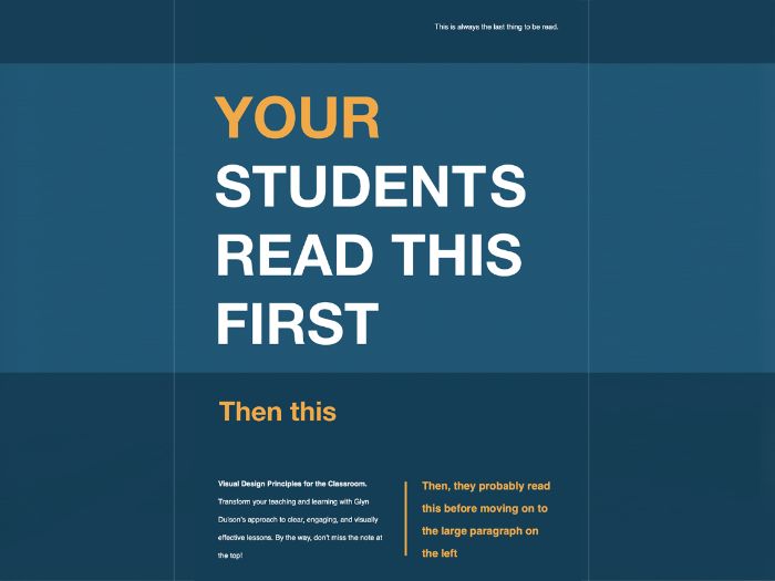
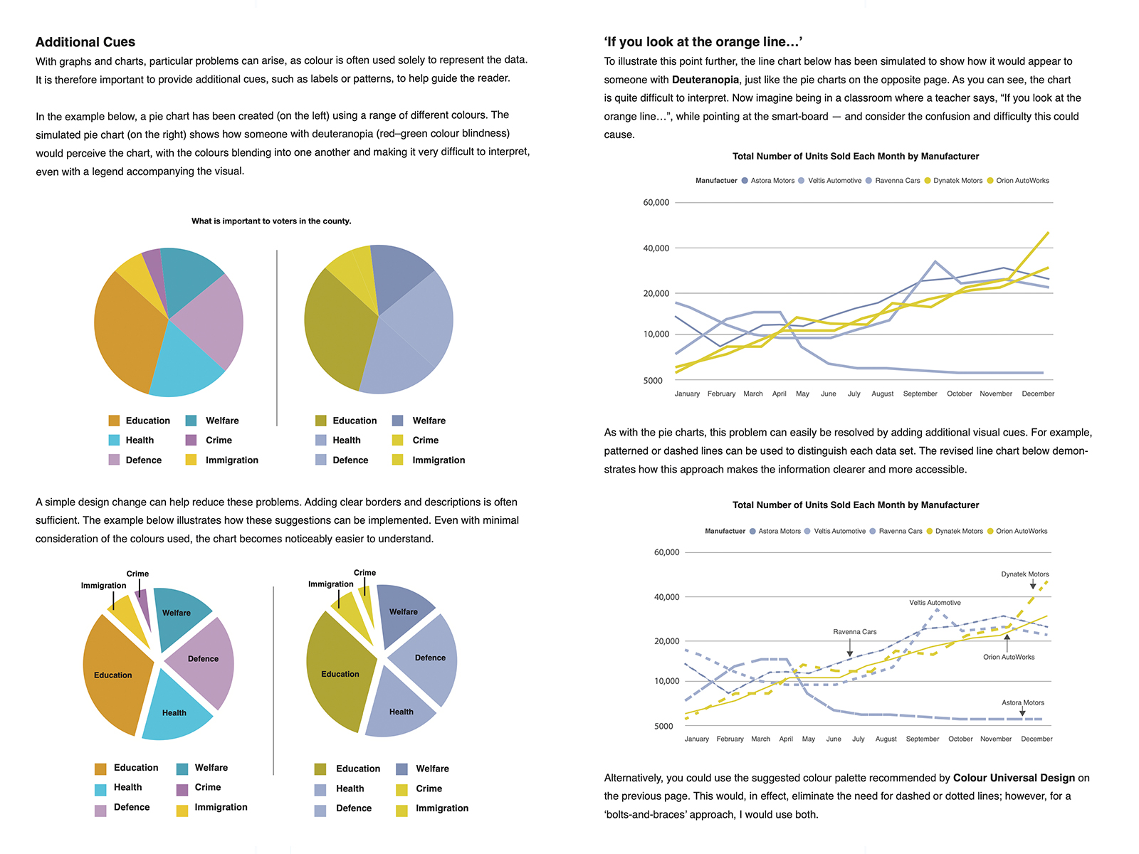
This 30-page booklet explores the challenges visually impaired students face when reading classroom materials, along with the simple, practical adjustments teachers can make in response. These include choosing the correct fonts, colour combinations, and page layouts. Each recommendation is underpinned by the science and theory behind visual perception and readability, drawing on research from leading experts in the design of educational materials for visually impaired learners.
Written by Glyn Dulson, a teacher of graphic design with over 22 years’ experience and a former professional graphic designer.
Something went wrong, please try again later.
This resource hasn't been reviewed yet
To ensure quality for our reviews, only customers who have purchased this resource can review it
Report this resourceto let us know if it violates our terms and conditions.
Our customer service team will review your report and will be in touch.