GCSE Maths Master Bounds 19 pages PDF
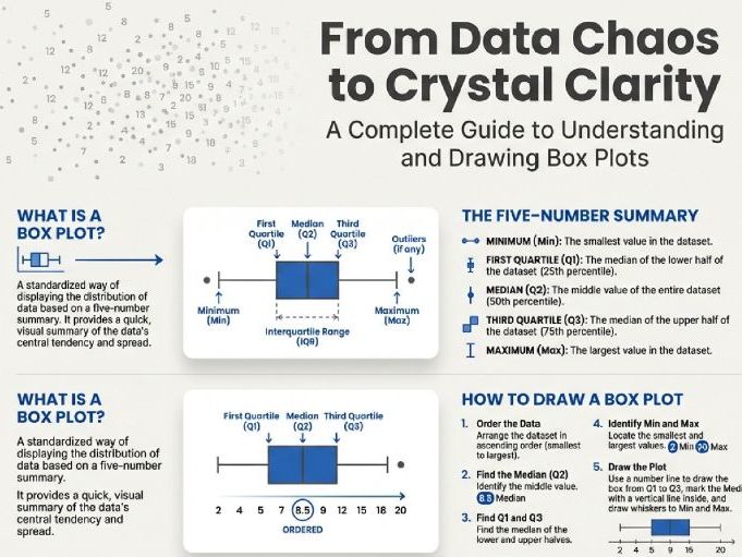
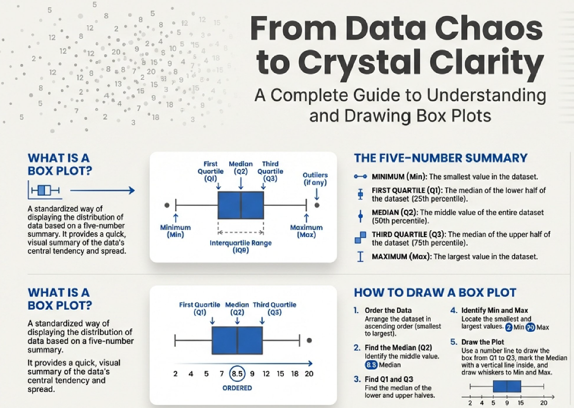
This document offers a detailed guide to understanding and constructing Box Plots, which are effective visual summaries of a data set’s spread. These plots illustrate five key values: the minimum and maximum data points, along with the three quartiles ($Q1$, $Q2$, and $Q3$), representing the $25%$, $50%$ (median), and $75%$ marks of the ordered data. The text emphasizes that box plots reveal two measures of spread—the range and the more reliable Interquartile Range (IQR), which is the difference between $Q3$ and $Q1$ and encompasses the middle $50%$ of the data, making it less susceptible to outliers. Ultimately, the purpose of a box plot is to present a quick, informative overview of data distribution, although it does not provide the total number of individual data points.
Something went wrong, please try again later.
This resource hasn't been reviewed yet
To ensure quality for our reviews, only customers who have purchased this resource can review it
Report this resourceto let us know if it violates our terms and conditions.
Our customer service team will review your report and will be in touch.
£1.00