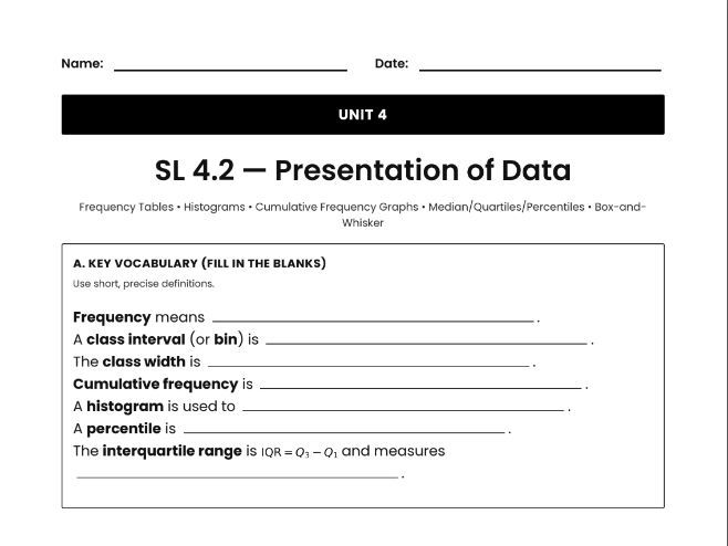
This IB Math AI SL 4.2 – Presentation of Data resource develops students’ understanding of how raw data is organised and displayed to reveal patterns, distributions, and summary information. The lesson builds conceptual clarity around frequency tables, cumulative frequency, and class intervals, helping students see how grouped data structures support meaningful graphical representations .
Students learn how histograms represent continuous data using adjoining class intervals, why cumulative frequency graphs must always increase, and how box-and-whisker plots summarise data using the five-number summary. Emphasis is placed on interpreting graphs rather than only constructing them, including recognising skew from whisker length and understanding how quartiles divide a data set .
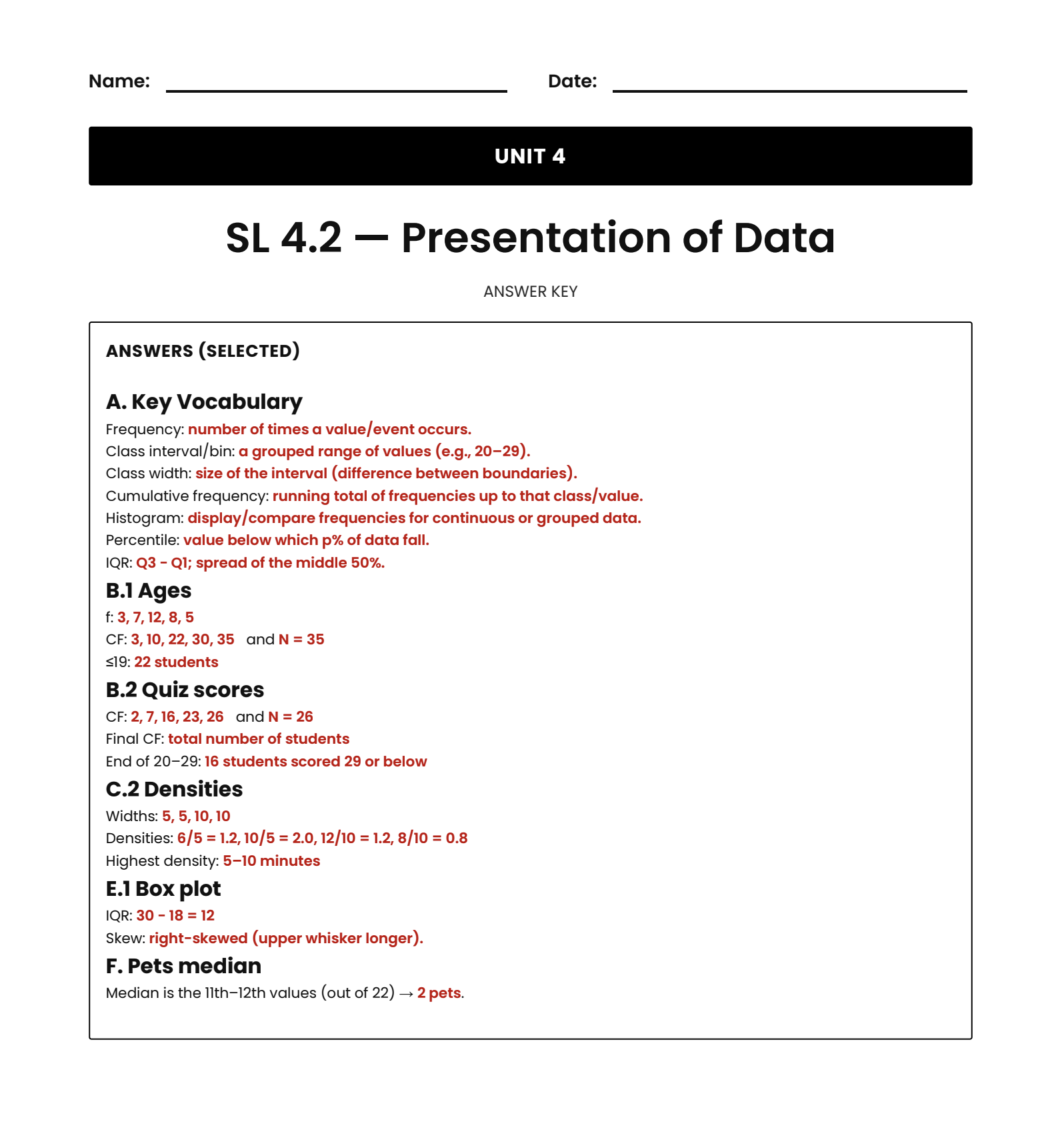
Structured tasks guide students through building frequency and cumulative frequency tables, determining class widths, identifying medians and quartiles, and connecting graphical features to statistical meaning. With scaffolded practice, realistic contexts, and a full answer key, this resource supports SL-level classroom instruction and independent study while strengthening students’ ability to analyse and communicate data in line with IB Mathematics AI expectations .
Get this resource as part of a bundle and save up to 30%
A bundle is a package of resources grouped together to teach a particular topic, or a series of lessons, in one place.
Something went wrong, please try again later.
This resource hasn't been reviewed yet
To ensure quality for our reviews, only customers who have purchased this resource can review it
Report this resourceto let us know if it violates our terms and conditions.
Our customer service team will review your report and will be in touch.
£3.00