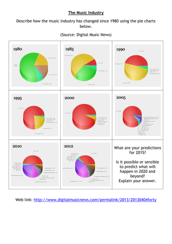


From a link on Twitter (thank you @beetlebug1) I put together this as an activity to describe the trends in sales in the music industry. This involves predictions too and should get students to read the pie charts carefully, seeing how statistics are used in a context they are familiar with.
Something went wrong, please try again later.
This is fantastic - thanks loads for sharing it! :)
A brilliant lesson making interpreting graphs engaging and relevant
This is a great idea. I plan to use it and extend for my year 9s and 10 to use the original source and produce a line graph showing the % of CD sales over time....thanks!
Report this resourceto let us know if it violates our terms and conditions.
Our customer service team will review your report and will be in touch.
£0.00