


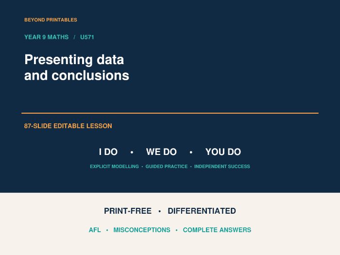
Help pupils move beyond reading a number from a chart to deciding what the data actually show. This 87-slide Year 9 PowerPoint develops chart interpretation, fair comparisons and evidence-based conclusions through a structured I Do, We Do, You Do sequence.
Designed for teaching from the board, the lesson gives pupils charts to read and questions to answer on mini whiteboards or in exercise books. No pupil printing is required.
WHY THIS LESSON WORKS
• Pupils read values from clear scales and gridlines: answers are not printed above the bars or plotted points.
• Questions progress from reading frequencies to calculating percentages, comparing unequal sample sizes and challenging unsupported claims.
• Grouped bars, stacked bars and line graphs provide varied decisions, rather than repeated versions of one calculation.
• Larger chart layouts keep the relevant questions and diagram together. One-page modelling and differentiated options are also included for flexible delivery.
• Answers explain the reasoning behind conclusions, supporting discussion and correction of misconceptions.
WHAT IS INCLUDED
• Six retrieval starter questions and answers.
• Six prerequisite checks and answers.
• Guidance on choosing suitable displays and writing supported conclusions.
• Three matched I Do / We Do pairs, a one-page overview option, and individual model questions with answers.
• Further examples on stacked bars and misleading vertical scales.
• 20 individual AFL questions, each followed by its answer.
• 24 practice questions using travel, club attendance and temperature charts, with compact answer pages.
• A one-page differentiated task with 8 Developing, 6 Secure and 4 Greater Depth questions, plus a Super Challenge.
• Larger versions of the differentiated tasks, with the chart alongside the questions.
• A Super Challenge comparing changes within a sample with adding new respondents.
• Three exit questions and answers.
MATHEMATICAL FOCUS
Choose displays for different purposes; interpret grouped and stacked bars; read changes on a line graph; distinguish a modal category from a majority; compare counts and percentages; recognise misleading scales; and explain why a sample or apparent relationship may not support a wider claim.
YOUR DOWNLOAD
An editable 87-slide PowerPoint lesson with questions, charts and answers.
Created by Beyond Printables for Year 9, Unit 24, U571: Presenting Data and Making Conclusions.
Something went wrong, please try again later.
This resource hasn't been reviewed yet
To ensure quality for our reviews, only customers who have purchased this resource can review it
Report this resourceto let us know if it violates our terms and conditions.
Our customer service team will review your report and will be in touch.
£3.00