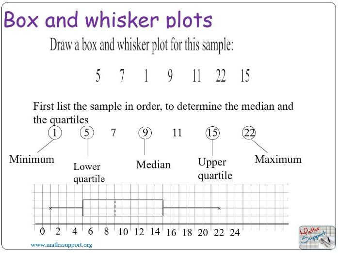
KS3 Maths Tutorial and Activity. Powerpoint presentation. Representing Data. Interpreting Data. How to draw a box and whisker graph and compare data from the median, interquartile, upper quartile, interquartile range and range.
Creative Commons "Sharealike"
Reviews
4.3
Select overall rating
(no rating)
Your rating is required to reflect your happiness.
Thanks for rating this resource. We are glad that you find it useful. You can find more resources for your lessons here in my shop or visit our website www.mathsssupport.net. As a way of saying thanks for your review, here is a coupon for 15% off your next purchase, good for the next 30 days on our website. Use this code: MSUPPORT_FB. You may use it on our website www.mathssupport.net
Empty reply does not make any sense for the end user
Thanks for rating this resource. We are glad that you find it useful. You can find more resources for your lessons here in my shop or visiting our website www.mathsssupport.net
Empty reply does not make any sense for the end user
Thanks for rating this resource. We are glad that you find it useful. You can find more resources for your lessons here in my shop or visiting our website www.mathsssupport.org
Empty reply does not make any sense for the end user