Data visualisation is a clear, classroom ready 6 lesson unit for Year 8 pupils that takes them from quick surveys to confident conclusions, with a strong focus on accuracy, fairness and decision making.
Pupils explore what counts as data, where it comes from and how patterns, outliers and bias can change the story. They design a five question Google Forms survey, collect responses then turn them into a spreadsheet dataset they clean using simple rules.
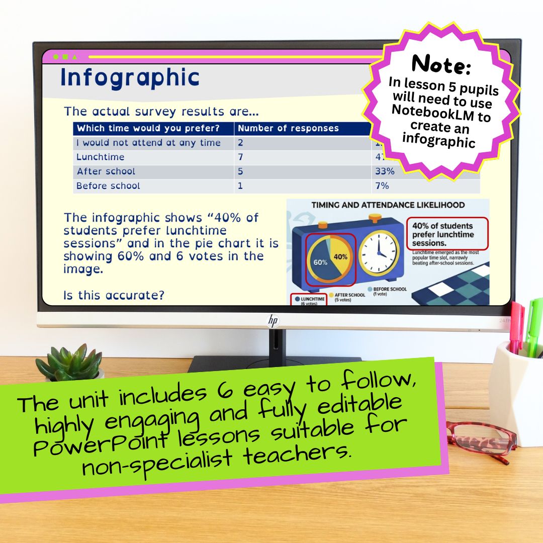
They then choose suitable graph types and learn how to avoid misleading graphs, including the difference between correlation and causation. In Lesson 5, pupils use NotebookLM to generate an infographic from their cleaned data and check it for accuracy. The unit finishes by linking class surveys to big data and AI, including validation, sampling and the risks of messy or biased training data.
Everything is fully planned and ready to teach, so you can deliver with confidence and build pupils’ digital literacy without spending hours creating resources from scratch.
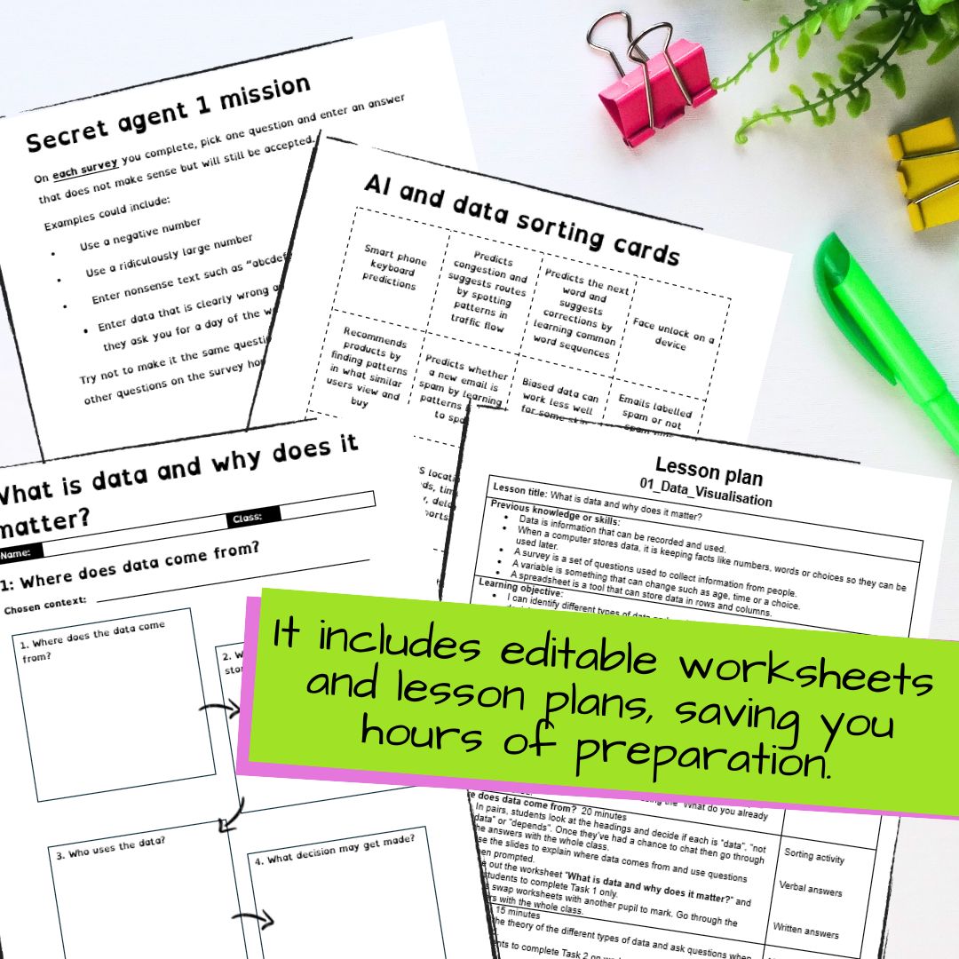
Includes fully editable PowerPoint presentations, lesson plans and worksheets.
LESSONS INCLUDED
1. What is data and why does it matter?
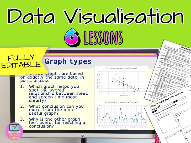
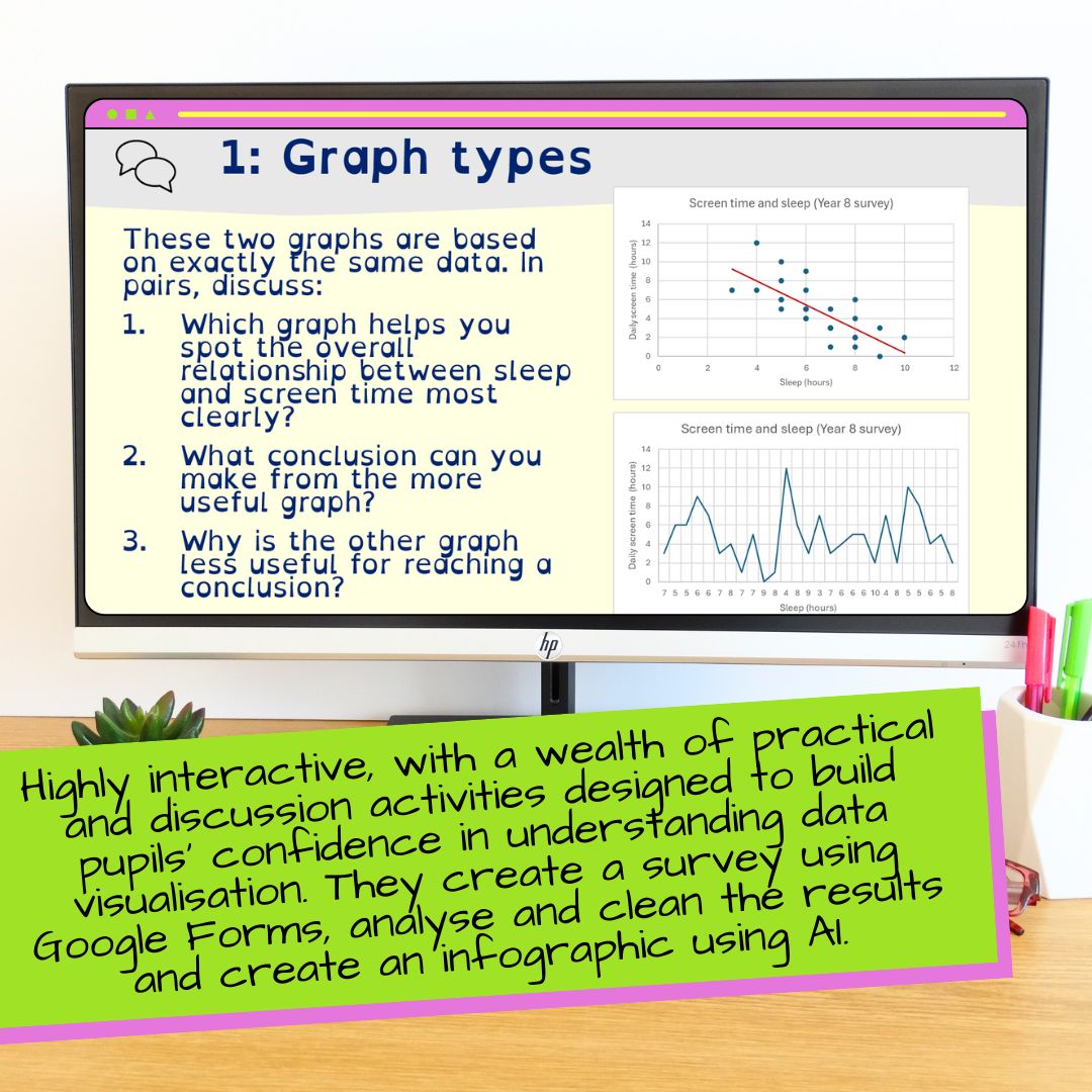
What counts as data, where it comes from, types of data, patterns, outliers and bias. Pupils practise judging whether a claim is supported by a dataset.
2. Ask better questions, get better data
Designing a focused survey with a clear topic and purpose. Pupils write fair questions using a mix of numeric, categorical, yes or no, rating and open text formats.
3. Errors, outliers and invalid entries
Collecting survey responses then spotting problems in results. Pupils learn what out of range values, invalid entries and outliers look like and what to do when something needs checking.
4. Data cleaning rules and bias
Cleaning a dataset using fix, remove, replace, group and flag. Pupils record changes and explain how cleaning choices can improve consistency but also introduce bias if assumptions are made.
5. Visualise, conclude and avoid misleading graphs
Choosing the right graph type, understanding correlation vs causal links and checking for misleading graphs. Pupils generate an infographic using NotebookLM then verify accuracy against the real dataset.
6. From tiny surveys to massive systems
Big data volume, variety and speed. Validation, sampling and how AI learns from training data. Pupils explore how messy or biased data affects real systems like spam filters and recommendations.
WHO IS THIS FOR?
Ideal for Year 8 classes including mixed ability groups. Great for teachers who want a practical data unit that builds confidence with surveys, spreadsheets, charts and critical thinking about fairness.
IMPORTANT
Lesson 5 requires pupil access to NotebookLM to generate an infographic.
Buy now to help pupils collect better data, clean it honestly and communicate conclusions clearly without falling for misleading graphs.
Something went wrong, please try again later.
This resource hasn't been reviewed yet
To ensure quality for our reviews, only customers who have purchased this resource can review it
Report this resourceto let us know if it violates our terms and conditions.
Our customer service team will review your report and will be in touch.
£52.00