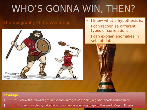

This resource is an opportunity to introduce basic correlation techniques in Key Stage 3. It looks at all the countries that made the final of the World Cup since 1950 along with their current population and HDI. It challenges students to explain anomalies in data (e.g. how come Uruguay did so well when its still a small, less economically developed country) and shows them how to draw their own scatter diagram to explore whether more socio-economically developed countries have more success (as measured by HDI).
Get this resource as part of a bundle and save up to 79%
A bundle is a package of resources grouped together to teach a particular topic, or a series of lessons, in one place.
The Geography of Summer Sports
This bundle should see you to the end of the summer term. Eight lessons altogether: four about the World Cup in Russia and then four about Wimbledon, which happens straight after we get knocked out of the football. Lots of concepts covered including waste management, sustainability, weather forecasting, economic geography, classification of industry, hooliganism and an interesting correlation exercise for those who like their statistics. Buy your department an end of year gift - all their remaning KS3 lessons planned and ready to roll for £10.00 or less.
Geography of the World Cup (Russia 2018)
This little bundle of four lessons will enable you to keep your students focused during the tournament. It will last as long as the England team do, anyway; about a fortnight, although you could extend some of the activities if we get past the group stages. There's one lesson that focuses on location, a second on the benefits and problems of running a global sporting event, another on building big stadiums and a fourth on examining hypotheses using correlation.
Something went wrong, please try again later.
This resource hasn't been reviewed yet
To ensure quality for our reviews, only customers who have purchased this resource can review it
Report this resourceto let us know if it violates our terms and conditions.
Our customer service team will review your report and will be in touch.