This resource includes:
A PowerPoint that can be used with a class,
A scaffolded student version of the PowerPoint with gaps for the students to fill in,
A differentiated worksheet with answers included.
This resource is suitable for Year 7, 8, 9 and 10 students and is linked to the Australian curriculum. This resource focuses on differentiating between numerical data (discrete or continuous) and categorical data (nominal and ordinal) and calculating the measures of central tendency (mean, median and mode) and the range of a numerical data set.
PowerPoint Presentation on Comparative Pie Charts (10 slides): Revises the equation for the area of a circle and finding fractions of amounts, before explaining how to draw and interpret comparative pie charts. It has been written by a highly experienced teacher (of 25+ years), senior examiner and reviser for Maths and Stats examinations. It includes:
Lesson objectives
Step-by-step explanations of the subject matter
Examples to aid understanding
Questions to check understanding
Answers to questions, with explanations
Suggestions regarding which topic(s) should be moved on to next.
It is 1 of a set of 13 PowerPoint Presentations on ‘Representing Data’ that APT Initiatives has published for GCSE Statistics. The full set of set of PowerPoints (225 slides excluding Title Pages) covers the following topics on ‘Representing Data’:
01 Block Diagrams and Dot Plots (12 slides).
02 Pictograms (16 slides).
03 Bar Charts, Bar Line Graphs and Frequency Diagrams – Polygons (26 slides).
04 Population Pyramids and Choropleth Maps (15 slides).
05 Line Graphs (9 slides).
06 Stepped Tables and Two-way Tables (18 slides).
07 Pie Charts (18 slides): Explains how to draw and interpret pie charts.
08 Comparative Pie Charts (10 slides).
09 Scatter Diagrams (40 slides).
10 Correlation Coefficients (11 slides).
11 Stem and Leaf Diagrams (17 slides).
12 Histograms (14 slides).
13 Misleading Graphs and other Data Representations (19 slides).
This set of PowerPoints are one of 4 sets of PowerPoint Presentations that APT Initiatives Ltd has published to support teachers and students of GCSE Statistics. Other sets concern:
Collecting Data
Analysing Data
Probability
The purchase of this resource comes with a licence to make the resource available in digital and / or in print form (including photocopying) to the staff and students attending the purchasing institution, ie the individual school / college on a single site. The resource may be distributed via a secure virtual learning environment. It must not be made available on any public or insecure website or other platform. The resource must not be distributed to other institutions that are members of the same academy chain or similar organisation; each individual institution must purchase their own copy of the resource.
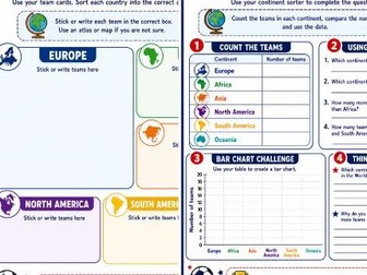
A geography and data-handling activity based on all 48 World Cup 2026 teams.
Includes:
Continent sorting activity
All 48 qualified teams
Data collection task
Bar chart challenge
Questions based on the completed data
Combines maths, geography and World Cup excitement
Perfect for KS2, lower KS3, statistics lessons and themed project work
This powerpoint is designed to cover the statistics required in the OCR A Level Biology specification A. It includes worked examples, practice questions and exam questions. It covers the following statistics:
Standard deviation
Chi-squared
T-test
Spearman rank
This fully-resourced lesson focuses on all three statistical test:
Student t-test
Correlation coefficient test
Chi-squared test
lesson will explore the following learning outcomes:
Describe when and why you would use each test
Be able to work out the degrees of freedom
Understand what the p value means
Conclude significance of the test based on the results
The detailed PowerPoint has been designed to cover the AQA A-level Biology specification math skills which states that students should be able to select and use statistical test.
Turn World Cup fever into high-impact learning with a ready-to-print mathematical data pack! Save hours of writing math problems with a beautifully formatted 5-page workbook pack (.pdf) that uses real-world tournament statistics to drill vital math concepts. Perfectly tailored for Key Stage 2 and Key Stage 3 (Ages 9-14) classrooms, early morning work, or end-of-term activities.
What’s Packed Inside the Data Set:
The Master Data Bank: Clean, engaging statistical tables tracking team FIFA ranks, historical goal counts, squad sizes, and player goal-efficiency ratios.
Task 1 (Statistics): Differentiated challenges tracking the Mean, Median, Mode, and Range of qualifying groups.
Task 2 (Time Zones): Real-world clock arithmetic and multi-step time calculation word problems spanning London, New York, Vancouver, and Mexico City.
Task 3 (Geometry & Coordinates): Strategic straight-line vector translations and coordinate pitch-plotting on a tactical grid matrix.
Task 4 (Fractions & Percentages): Calculations covering stadium capacity percentages, goal conversion metrics, and ratio reductions.
Why Teachers Love This Resource:
Built-in Teacher Answer Key: Includes a complete, step-by-step master mark scheme for immediate grading or quick student peer-assessment.
Zero Planning Required: Crisp typography and beautifully spaced formatting ensure it prints flawlessly straight out of the box.
Cross-Curricular Value: Blends core mathematical curriculum criteria with active student passion for sports and geography.
Download this premium pack today and get your students excited about data analytics and statistics!
Search Tags
World Cup maths worksheets, data handling statistics, time zones word problems, coordinate grid vectors, mean median mode range, fractions percentages math, key stage 2 end of term, sports mathematics.
This resource includes tally charts to be completed, making pictograms and interpreting data from pictograms and tables, involving counting in 1, 2s, 5s and 10s. These activities will supplement maths schemes and focus on the objectives of the year 2 maths curriculum - statistics.
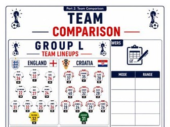
A ready-to-use World Cup 2026 maths activity using team line-ups and player age data.
Includes:
REAL Visual team line-up sheets
REAL Player age data
Mean, median, mode and range questions
Team comparison activities
Football-themed reasoning challenges
Perfect for KS2, lower KS3, statistics lessons and end-of-term maths
This set of worksheets is intended for practice in drawing line graphs based on data given in tables. They follow on from lesson 4 in a lesson sequence available on TES. Some interpretation questions are also included.
Differentiated:
3 dots = higher ability, 2 dots = middle ability, 1 dot = lower ability
Download the 4 lesson sequence these worksheets correspond with via the link:
https://www.tes.com/teaching-resource/data-4-lesson-smart-notebook-slides-tables-two-way-tables-line-graphs-ks2-11995417?theme=4
For other worksheets from this series, follow these links:
Simple Tables - https://www.tes.com/teaching-resource/simple-data-table-differentiated-worksheets-ks2-statistics-11995451
Two-way Tables - https://www.tes.com/teaching-resource/two-way-tables-differentiated-worksheets-data-statistics-ks2-11995458
Interpreting Line Graphs - https://www.tes.com/teaching-resource/interpreting-line-graphs-differentiated-worksheets-ks2-11995467
Are you looking to transform your students from passive number-crunchers into sharp, critical thinkers? Go beyond rote memorization of formulas with this comprehensive Data Literacy and Statistics curriculum designed to build true analytical skills for the 21st century.
In a world saturated with data, misinformation, and misleading graphs, statistical literacy is no longer optional—it’s an essential life skill. This all-in-one digital resource is meticulously crafted for high school and introductory college-level classrooms, providing everything you need to guide students on a journey from core theory to real-world application. This isn’t just another packet of math problems; it’s a framework for thinking.
Students will move beyond “what” to “why,” learning to question data, identify bias, deconstruct misleading visualizations, and understand the profound difference between correlation and causation. With engaging, relevant examples (from e-sports to medical studies) and rigorous case studies, this unit makes abstract concepts tangible and memorable.
WHAT’S INCLUDED (45-Page PDF):
Phase 1: Core Content & Theory: A 14-page “textbook” style guide that clearly explains foundational concepts.
The Anatomy of Data (Qualitative, Quantitative, Discrete, Continuous, Levels of Measurement)
Descriptive Statistics (Mean, Median, Mode, Variance, Standard Deviation, IQR)
Data Visualization & Misrepresentation (Anscombe’s Quartet, Truncated Axes, The Bubble Fallacy)
Probability, Correlation, and Causation (Spurious Correlations, Confounding Variables)
Phase 2: Student Workbook: 10 detailed, multi-question worksheets (20 pages) that challenge students to apply the theory. Topics include:
Categorical vs. Quantitative Data
Contextualizing Mean, Median, and Mode
Variance, Spread, and Dispersion
Decoding Histograms and Box Plots
Correlation vs. Causation
Probability and Expected Value
Sampling Methodologies and Bias
The Normal Curve (68-95-99.7 Rule) & Z-Scores
Margins of Error & Confidence Intervals
The Ethics of Metrics & Misleading Statistics
Phase 3: Visuals & Teacher Resources:
3 High-Quality Conceptual Visualizations (SVG): Perfect for classroom projection or as student handouts (PPDAC Cycle, Distribution Shapes, Confounding Variables).
A Comprehensive 7-Page Teacher Answer Key: Includes not just the answers, but pedagogical justifications to guide classroom discussions and deepen student understanding.
This resource is perfect for a full unit in a statistics course, a supplement for an Algebra 2 or Pre-Calculus class, an AP Statistics review, or a homeschool curriculum. Empower your students with the defensive armor of statistical literacy. Download today and start building a more data-savvy generation!
Keywords: Data Literacy, Statistics Worksheets, AP Statistics, High School Math, Mean Median Mode, Correlation Causation, Normal Distribution, Z-scores, Data Visualization, Critical Thinking, Real-World Data, Statistics Project, Answer Key Included, Digi
A short activity which demonstrates the importance of correctly interpreting data.
This is a PowerPoint presentation telling the true story of mathematician Abraham Wald. He was employed by the US Army during WW2 to help with the war effort. An excellent activity for students with a range of ability levels.
The information is from “How Not to be Wrong: The Hidden Maths of Everyday Life” by Jordan Ellenberg. I found it an excellent read and would recommend to all maths teachers.
This is the complete module on the topic of organization of data in statistics and economics. It is an exclusive resource where the topics are arranged in a very informative and interesting manner. All the topics are supported by examples and animations. The animated presentation will help you to understand the concept in a very simple and easy way. Each concept is explained with the help of illustrations, images, and outstanding animations. All the concepts are self-explanatory and narrative. This resource will be an added help for your studies nd exam preparations. The presentation is equally important to the students who are studying accountancy and the teachers who instruct the subject.
Total Slides : 47. It's not just a ppt. It's a Complete interactive module with animation and background sound. This will give you an ultimate learning experience for sure.
Contents:
Collection of data
Classification of data
Basis of classification
Variables
Raw data
Statistical Series
Individual series
Continuous series
Frequency Distribution
Types of frequency distribution
Glossary _ Class limits, Frequency, Tally marks, Magnitude etc...
These engaging Math Games combine hands-on Math Practice with immersive Math Activities that turn probability and statistics into an unforgettable Math Adventure. Perfect for Homeschool families and Independent Learning, this resource requires zero math background to teach successfully. Loaded with structured Lesson Activities that build genuine Critical Thinking, it is an essential addition to any Teacher Resources collection. Featuring authentic Probability Activities and Statistics Activities wrapped inside a mystery-solving format, this Game-Based Learning gamebook makes abstract concepts click for every learner.
THE DATA DETECTIVE BUREAU: A Mystery Adventure Through Probability and Statistics
The Bureau’s Chief Statistician has vanished, leaving behind only a locked filing cabinet and a cryptic note: “Trust the numbers, not the story anyone tells you about them.” Students step into the role of a Data Detective, solving 10 self-contained cases to uncover the truth, building real statistical reasoning one clue at a time.
COMPLETE AND READY TO USE
This is a full, done-for-you gamebook with everything included: Discovery Briefings that teach each concept from scratch, Evidence Card challenges, built-in hints, a substitution-cipher worked example, clue tracking, a Complete Answer Key with full worked explanations, extension activities, reflection questions, and a printable Certificate of Achievement. No prep and no supplemental materials needed.
BUILT FOR PARENTS WITH NO MATH BACKGROUND
Every case opens with a plain-language Discovery Briefing and closes with a genuine real-world connection, so parents and tutors with little or no math experience can confidently guide students through every concept. No teaching degree required, making this ideal for homeschool co-ops, tutoring sessions, and independent study.
WHAT’S INSIDE - 10 FULL CASES
Mean, median, and mode; range and standard deviation; simple probability; independent vs. dependent events; the normal distribution; sample size and reliability; correlation vs. causation; confidence intervals; plus a cumulative Final Case tying every skill together.
CURRICULUM ALIGNED WORLDWIDE
Carefully built to align with introductory probability and statistics standards across the US, UK, Canada, Australia, Europe, Asia, and International curricula, making it a trusted, versatile resource for classrooms and homeschools anywhere in the world.
APPROXIMATE COMPLETION TIME: 4-5 hours, ideal for spreading across multiple sessions.
Perfect for high school and college or university statistics units, homeschool math curriculum, substitute lesson plans, tutoring centers, and math enrichment.
Grab your copy today and let your students crack the case.
CIE 9709/06 - Statistics Representation of Data. Slides on, Whiskers plot, standard deviation, frequency density, cumulative frequency, stem and leaf and coding. Past years exam questions and marking scheme from representation of data unit.
The 1st in Mr Barton's Gapminder World Video series. This is an introduction which takes you through how to access the Gapminder World website and how to use some of the basic tools, such as how to select different variables, highlight specific countries, and track changes through time. Below the video you will find an option to download it and play it on a larger screen, or by clicking on the web-link you can see all the videos in this series