This is a one hour exam preparation lesson to show A Level Biology students how to answer exam questions which require them to interpret data.
It begins by looking at how to describe data that’s presented in a table or a graph, and then how to explain data or draw conclusions from the data. There are lots of example exam questions which require students to practice each type of skill so that patterns in the structure to their answers and the mark scheme can be highlighted.
Examiner’s reports for all questions are also included on the PowerPoint and in the student resource pack so that they can read them and reflect on their own answers as they work.
Resources included: Powerpoint with all exam questions, mark schemes and examiner’s plus student resource which includes the same.
I have fully completed and gone over the Digital Information Technology COMPONENT 2: Collecting, Presenting and Interpreting Data Pearson Set Assignment Jan 2027.
This is a great guide to help you complete the new released Jan 2027 paper.
Great tool to assist the marking process so you can check and cross reference against the provided answers.
Included is a fully completed Excel Spreadsheet with all completed tasks for 2A 2B and 2C as well as a complete ‘how to guide’ on PowerPoint. Additonal slides on the PowerPoint guide for Tables, Sparklines and Line Graphs in the answers section.
Also updated the completed Spreadsheet with this included.
Fully completed examplar answers for task 3 errors patterns and trends, as well as a guide on responding well to task 1, task 1 is generic and can be used on any PSA, not just the Jan 2027.
Fully completed suggested answer Task 1, Task 2ABC, and Task 3 from the current specification. (not to be shared with students).
A bonus task to help students with task 2C - this task uses generic data, not the PSA data and can be shared with the students. This will guide students on how to create tables, charts and sparklines.
Comprehensive lesson containing a full presentation and model answers included.
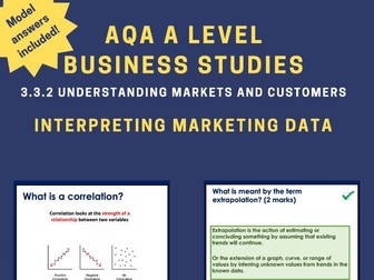
The lesson outlines all the specification of 3.3.2 Understanding markets and customers
This is lesson 5/8 in 3.3.2
This lesson teaches the following content:
Correlations
Scatter Charts
Extrapolation
Confidence Intervals
Key features of this lesson include:
• Retrieval practice questions
• Pre-Formatted slides (with the option of editing them too with slide master)
• PeCanPie Essay Planner Free
• Answers given
• Real life examples
• Scaffolding for lower ability
• Updated to new specification
• All questions based on real questions that have appeared in exams
Click on the link below to check out a FREE AQA A Level Business lesson to get an idea of what this resource entails:
Price Elasticity of Demand
https://www.tes.com/teaching-resource/resource-13054401
Please find within this download:
A detailed and engaging PowerPoint, Differentiated (SEN, LA, MA, HA & Mastery) Worksheet with Answer Sheet for a complete lesson on this National Curriculum Statement: Interpret and present data using bar charts, pictograms and tables.
The PowerPoint has the following features:
→ Differentiated starter activity (plus extension)
→ Extremely logical and simplistic explanations with animated examples and pictures to aid learning
→ Clear, detailed and engaging activities built into the PowerPoint to aid your AfL as you teach
→ Tasks linked to and based around identifying information from bar charts, pictograms and tables
→ Beautiful animations, images and graphs used to draw children’s attention to the key messages of the PowerPoint
→ Learning Objective and differentiated success criteria which is clearly visible for all children
→ Animated count-down timer so children know how long they have left of the lesson (this is also good for teachers as it reminds you when to do mini-plenaries/feedback/etc).
The Word Document has the following features:
→ Differentiated activities on one sheet from SEN, LA, MA, HA and Mastery Challenge
→ Coloured activity boxes to help you quickly assign tasks to children
→ Learning objective and short date (which automatically updates to the day you open the document)
→ Differentiated success criteria that link with the PowerPoint
→ Answer sheet included for all questions
Explore our other Year 3 Statistics Lessons:
Interpret and present data using bar charts, pictograms and tables
Solve one-step and two-step questions (for example ‘How many more’ and ‘How many fewer?’) using information presented in scaled bar charts and pictograms and tables
A set of questions on interpretation and presentation of data, observation, fair testing, use of different keys. Some questions can give you ideas for lab activities.
I have fully completed and gone over the Digital Information Technology COMPONENT 2: Collecting, Presenting and Interpreting Data Pearson Set Assignment June 2026.
This is a great guide to help you complete the new released June 2026 paper.
Great tool to assist the marking process so you can check and cross reference against the provided answers.
Included is a fully completed Excel Spreadsheet with all completed tasks for 2A 2B and 2C as well as a complete ‘how to guide’ on PowerPoint.
Fully completed examplar answers for task 3 errors patterns and trends, as well as a guide on responding well to task 1, task 1 is generic and can be used on any PSA, not just the June 2026.
Fully completed suggested answer Task 1, Task 2ABC, and Task 3 from the current specification. (not to be shared with students).
06/1/2026 - added a task to help students with task 2C - this task uses generic data, not the PSA data and can be shared with the students. This will guide students on how to create tables, charts and sparklines.
06/1/2026 - added a new Slide on the PowerPoint guide for Tables, Sparklines and Line Graphs in the answers section.
Also updated the completed Spreadsheet with this included.
I made this up after working on similar resources to find information from data. There is a much simpler version at the bottom for children with AEN. Most children were able to work on one step problems when interpreting data. Once this is completed I will give them one and two step problems. More able will be able to write their own.
A really fun and unusual lesson using a piece of sheet music to collect data using a tally chart, interpret from a tally chart, present the data in a bar chart and pie chart and further interpret the data using a real-life question. Very enjoyable and no knowledge or prior understanding of sheet music needed. Also Christmas themed (the song used is Jingle Bells) so great for engaging students at that time of year.
A bundle containing the full specification of content for the topic AAQ Pearson Medical Science - Unit 2E: Interpretation, analysis and evaluation of scientific information
The lesson order is as follows:
• Methods of Data Collections (24 slides)
• Processing Scientific Data (22 slides)
• Data Presentation (24 slides
• Investigation Design Evaluation (20 slides)
• Data Evaluation (24 slides)
Over 110 slides worth of content!
All lessons follow a similar structure and design with:
• Learning objectives and specification link
• Recall starter activity with answers based on previous lesson
• Explanation slides with clear concise diagrams - chunked in an easy to understand format
• Variety of practice activities including exam questions, gap fills, differentiated questions etc.
• Answers for all questions
• All easily editable to adapt to your teaching or to use in existing lessons although all lessons are ready to go
• Minimal printing - I understand how limited printing budgets are so printing is mostly restricted to small diagrams and reusable fact sheets.
• The occasional fun and interesting fact.
If any of my resources have saved you time, please leave a review - it helps others know if these resources are worthwhile! Please do contact me if there are any issues with content
Includes:
- Finding and sorting Information
- Displaying Information (line graphs, tally charts, bar charts/graphs, Carroll diagrams and Venn diagrams)
- Code breakers
- Interpreting data
Can be adapted for upper KS1 and lower KS2
This resource is an introduction to statistics.
It contains nine subjective questions on presentation of data in a frequency table, it essentially deals with interpretation of data presented in a frequency table.
It is a good resource to use as an exit card or even as an review of previous knowledge.
I hope you find it useful.
THANK YOU
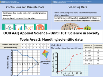
Course: OCR Level 3 Alternative Academic Qualification Cambridge Advanced Nationals in Applied Science.
Unit F181: Science in society
Topic Area 2: Handling scientific data
2.1 Types of scientific data
2.2 Collecting scientific data
2.3 Storage and presentation of scientific data
2.4 Interpreting data
Qualitative and quantitative data
Continuous and discrete data
Data from observations and
measurements
Primary and secondary data
Observation and measurement
from experiments
Surveys
Sampling
Random
Systematic
Estimation
Cohort studies
Meta-studies
Computer modelling
Personal database
National database
International database
Scatter and line graph
Bar chart
Histogram
Pie chart
Kite diagram
Cumulative graph
Box and whisker plots
Draw conclusions
Accept or reject a hypothesis
Inform further scientific
investigation
Mathematical skills include:
Calculate the mean, median, mode, range (e.g. height of group of organisms, number of stomata in a plant).
Determining the intercept and/or gradient using y = mx + c.
Calculating the rate of change from a graph with a linear relationship (e.g. rate of transpiration).
Drawing a tangent to a curve on a graph to calculate the rate of change (e.g. amount of product produced against time, at a fixed concentration of enzyme).
Calculate the standard deviation of a set of data.
Hi… This resource is specifically based against the IGCSE Computer Science syllabus, but is suitable for any Data Storage module. It includes some knowledge tests at the beginning and leads on to creating 5 groups to work on a presentation about a different element of Data Storage. The group worksheets can be handed out or sent electronically and each has a series of keywords to prompt research. Each group is challenged with answering one Big Question and explaining it to the class at the end of the lesson.
If you find the resource useful please leave a review so that others can find it.
HackDragn
PowerPoint Presentation on Comparative Pie Charts (10 slides): Revises the equation for the area of a circle and finding fractions of amounts, before explaining how to draw and interpret comparative pie charts. It has been written by a highly experienced teacher (of 25+ years), senior examiner and reviser for Maths and Stats examinations. It includes:
Lesson objectives
Step-by-step explanations of the subject matter
Examples to aid understanding
Questions to check understanding
Answers to questions, with explanations
Suggestions regarding which topic(s) should be moved on to next.
It is 1 of a set of 13 PowerPoint Presentations on ‘Representing Data’ that APT Initiatives has published for GCSE Statistics. The full set of set of PowerPoints (225 slides excluding Title Pages) covers the following topics on ‘Representing Data’:
01 Block Diagrams and Dot Plots (12 slides).
02 Pictograms (16 slides).
03 Bar Charts, Bar Line Graphs and Frequency Diagrams – Polygons (26 slides).
04 Population Pyramids and Choropleth Maps (15 slides).
05 Line Graphs (9 slides).
06 Stepped Tables and Two-way Tables (18 slides).
07 Pie Charts (18 slides): Explains how to draw and interpret pie charts.
08 Comparative Pie Charts (10 slides).
09 Scatter Diagrams (40 slides).
10 Correlation Coefficients (11 slides).
11 Stem and Leaf Diagrams (17 slides).
12 Histograms (14 slides).
13 Misleading Graphs and other Data Representations (19 slides).
This set of PowerPoints are one of 4 sets of PowerPoint Presentations that APT Initiatives Ltd has published to support teachers and students of GCSE Statistics. Other sets concern:
Collecting Data
Analysing Data
Probability
The purchase of this resource comes with a licence to make the resource available in digital and / or in print form (including photocopying) to the staff and students attending the purchasing institution, ie the individual school / college on a single site. The resource may be distributed via a secure virtual learning environment. It must not be made available on any public or insecure website or other platform. The resource must not be distributed to other institutions that are members of the same academy chain or similar organisation; each individual institution must purchase their own copy of the resource.
Presenting Data Pack includes the following :
Bar Charts and Pictograms - Drawing and interpreting
Draw Pie Charts - Draw given the angle, Calculate the angle and draw
Percentage Bar Diagrams - Draw and interpret % bars for real contexts
Stem and Leaf Diagrams - order, draw, interpret, median, back to back
Scatter Diagrams - Draw and interpret - Includes team relay activity
Averages and Range from data and charts - calculations
Cumulative frequency and box plots - draw cf, median and quartiles, draw box and interpret
Histograms - Draw , interpret, and calculate the mean
One Set of Data - Revision task using one set of data .... produce pie chart, mean, frequency polygon, cumulative frequency, box plot and histogram.
This PowerPoint follows the Oxford textbook.
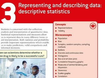
The following content is covered throughout the PowerPoint. I have also added a few extra concepts which can be used in students Internal Assessments (IA). For example, I spend a little time looking at the skewness formula, different ways of calculating outliers, 1.5 x IQR or 2 X SD, skewness in box plots, etc.
Univariate data
* qualitative vs quantitative
* continuous vs discrete
* which representations are used for specific types of data
* primary and secondary data
* choosing a good sample
* sampling bias
* reliability vs validity
* skewness
Questionnaires
* biased questions
Measures of central tendency
* mean, meadian, mode
* outliers
* un-grouped and grouped
* how to use the GDC
* combined mean
Measures of dispersion
* range, quartiles, IQR, standard deviation
* normal distribution curve
* skewness
* different formulas for sample and population for SD
* how to use the GDC
* effects on mean and SD
Sampling techniques
Presentation of data
Bivariate data
* scatter graphs
* correlation
* introduction into the line of best fit (leading into chapter 6)
Throughout the PowerPoint there are worked examples and student exercises. There are also multiple links to various classroom and interactive activities using GeoGebra and Desmos Classrooms. As well, I have included links to certain Youtube videos to help with using the GDC.
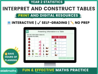
Introducing this comprehensive digital maths resource designed specifically for Year 2 students to master the art of presenting and reading information from tables in statistics! With this interactive learning tool, students will develop a solid foundation in data representation and analysis while having fun along the way.
Save over 20% when you buy it as part of the Tables and Tally charts Bundle
Our Year 2 Statistics Digital Resource provides a dynamic and engaging learning experience that captures students’ attention from start to finish. The carefully crafted content is aligned with the curriculum standards, ensuring that students are equipped with the necessary skills and knowledge needed in interpreting and representing data using tables.
Through a series of interactive lessons and activities, your year 2 students will learn how to create, interpret, and use tables effectively. They will discover the significance of tables as a quick and efficient way to record and count data. With the guidance of our intuitive interface, students can practice creating tables in a virtual environment, enabling them to sharpen their skills at their own pace.
To enhance the learning experience, our Year 2 Statistics Digital Resource incorporates interactive self-marking activities using vibrant graphics. Students can put their knowledge to the test with interactive challenges that reinforce their understanding of tables. Additionally, our resource offers progress tracking features, allowing students and educators to monitor performance and identify areas for improvement.
Whether used in the classroom or at home, our Year 2 Statistics Digital Resource provides an immersive learning environment that supports students’ growth in statistics.
Other related resources in this category include:
Carroll and Venn diagrams
Block Diagrams
3.Tally Charts
I made this worksheet for Year three children. They have to label the horizontal bar chart, complete the tally chart and then answer some True or False questions and explain how they know, to prove it. The questions are differentiated. LO and SC on the worksheet to help with marking.
Will save lots of time.
This resources enables children to read and interpret information from pictograms, make comparisons and ask questions about data. It includes worksheets linked to WRM fluency tasks 1 & 2 and reasoning questions.
WRM Small Step: pictograms
Curriculum links:
-Interpret and present data using bar charts, pictograms and tables.
-Solve one-step and two-step questions [for example, ‘How many more?’ and ‘How many fewer?’ using information presented in scaled bar charts and pictograms and tables.
Enjoy!
Your feedback is always welcome x
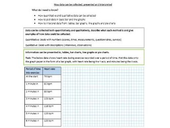
Student worksheets for ‘How data can be collected, presented and interpreted’. Pack includes; a lower ability worksheet, a higher ability worksheet and a teacher answer sheet.
Please find within this download:
A detailed and engaging PowerPoint, Differentiated (SEN, LA, MA, HA, Mastery and Greater Depth) Worksheet with Answer Sheet for a complete lesson on this Year 4 statistics statement: interpret and present discrete and continuous data using appropriate graphical methods, including bar charts and time graphs
The PowerPoint has the following features:
→ Differentiated starter activity and extension
→ Extremely logical and simplistic explanations with animated examples and pictures to aid learning
→ Shows exactly how to interpret and present discrete and continuous data using appropriate graphical methods, including bar charts and time graphs
→ Learning Objective and differentiated success criteria which is clearly visible for all children
→ Animated count-down timer so children know how long they have left of the lesson (this is also good for teachers as it reminds you when to do mini-plenaries/feedback/etc).
The Word Document has the following features:
→ Differentiated activities from SEN to greater depth
→ Coloured activity boxes to help you quickly assign tasks to children
→ Learning objective and short date which automatically show the correct date
→ Differentiated success criteria that link with the PowerPoint
→ Answer sheet included for all questions
Explore our other Year 4 Place Value Lessons:
Interpret and present discrete and continuous data using appropriate graphical methods, including bar charts and time graphs
Solve comparison, sum and difference problems using information presented in bar charts, pictograms, tables and other graphs
 Quick View